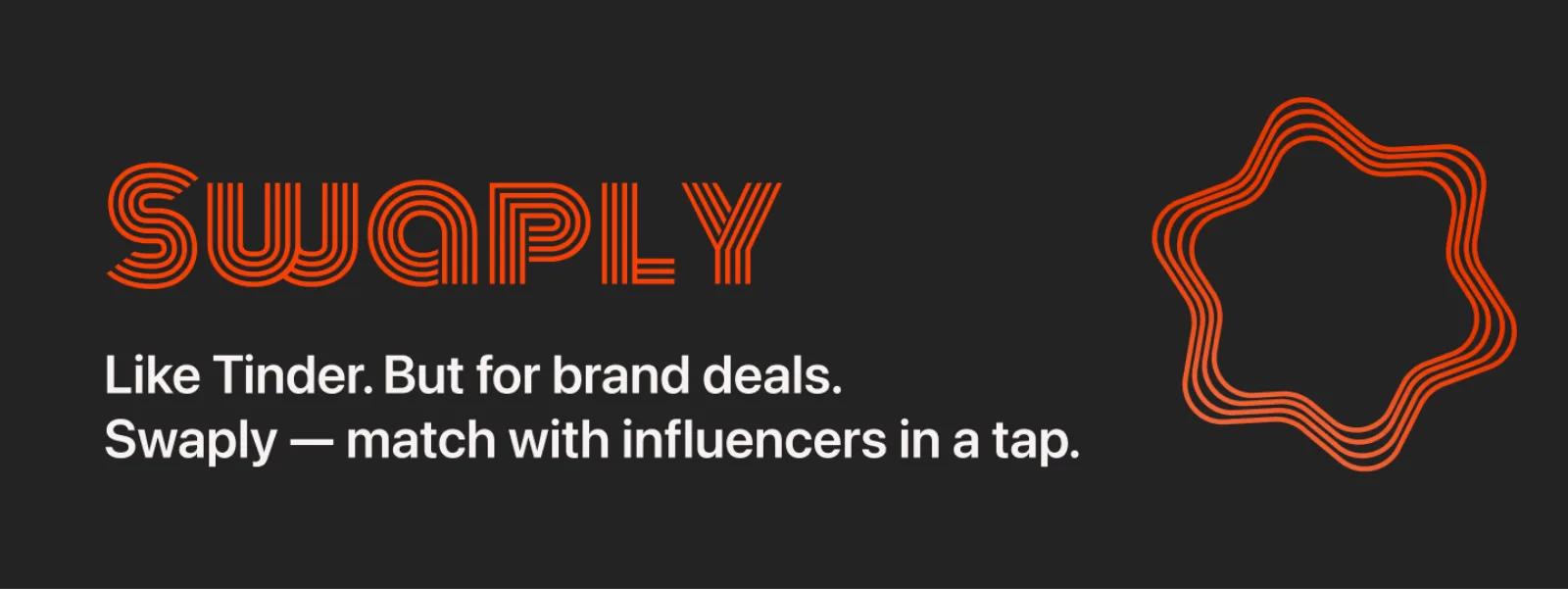
Swaply — a mobile app built around one swap
A focused mobile experience designed around a single job-to-be-done. Bold typography, vivid red, opinionated UX.
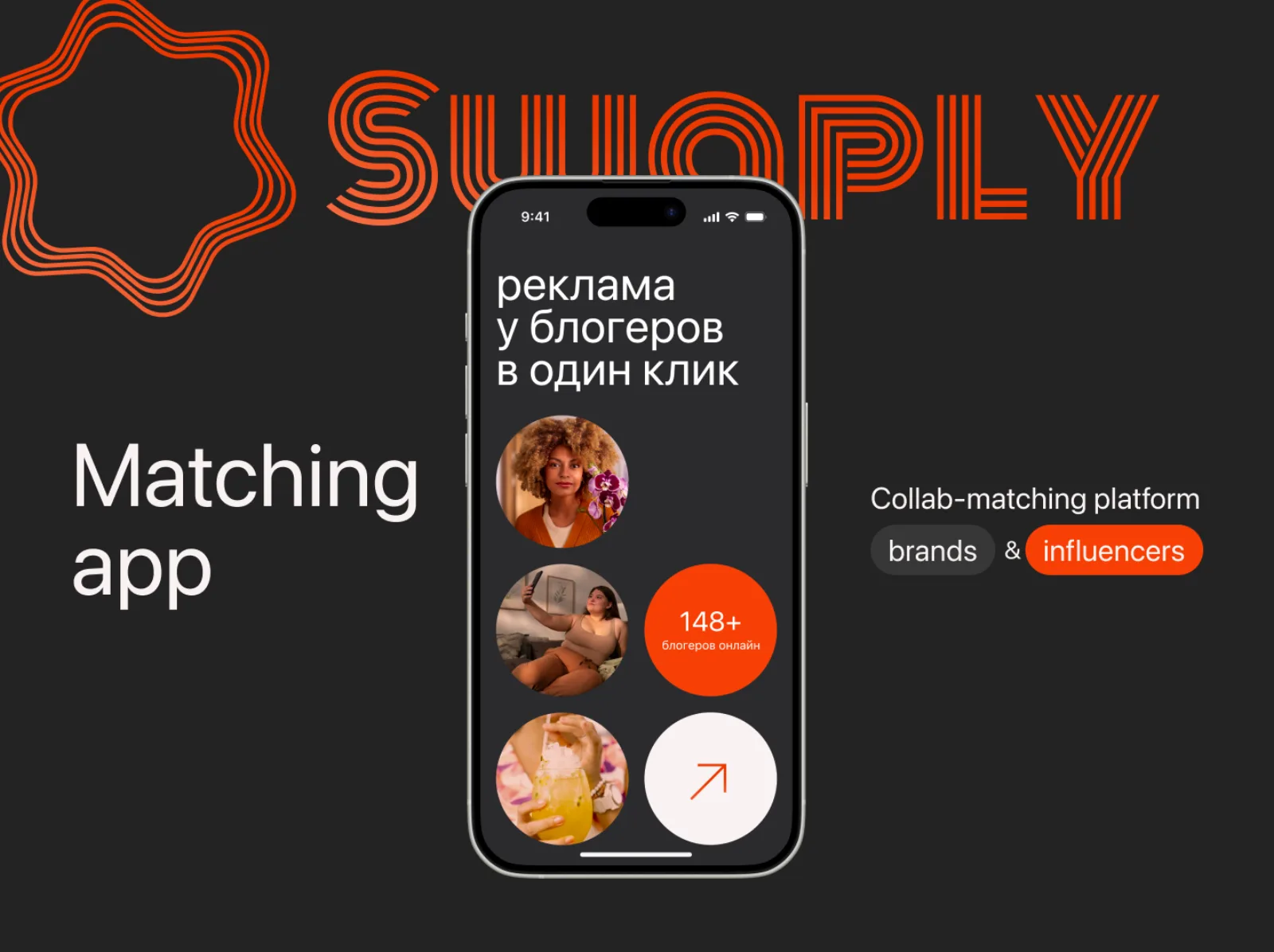
One job. Done well. Repeated often.
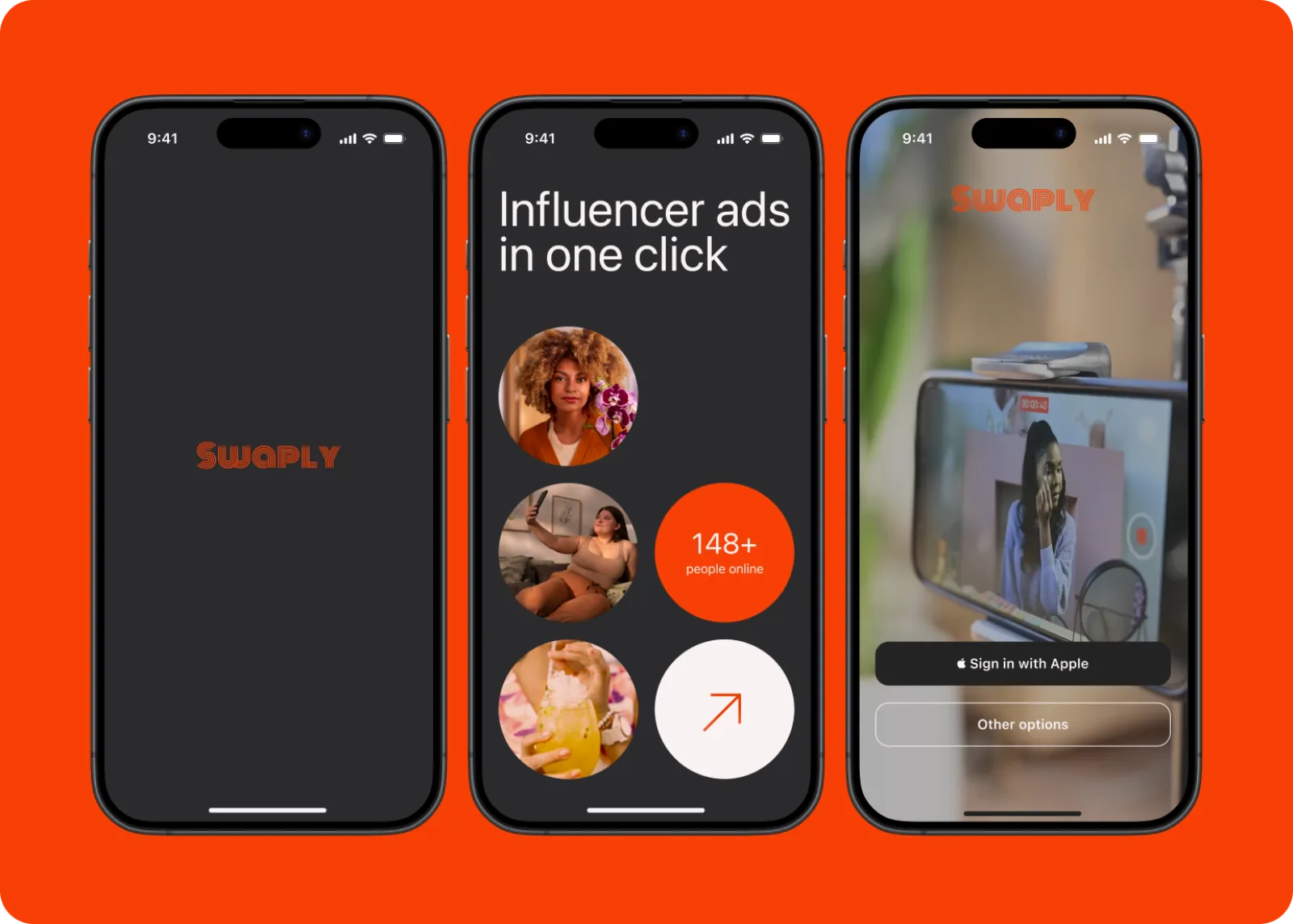
Most apps in this space try to be a marketplace, a chat, a feed and a social network at once. Swaply is the opposite — a single-purpose app for one specific swap, designed to be opened, used, and closed in under a minute.
We started by writing the JTBD on a single line: "When I want X, help me get it from someone nearby — without negotiating." Every screen had to defend itself against that sentence.
Brand and product, designed together
Swaply uses a single accent — a saturated red — to drive attention to the only action that matters on each screen. Type is large, opinionated, and rarely competes with controls. Backgrounds carry product photography to keep the app physical, not abstract.
We treated brand and product as one surface from day one. The hero word, the call-to-action and the navigation use the same visual rhythm.
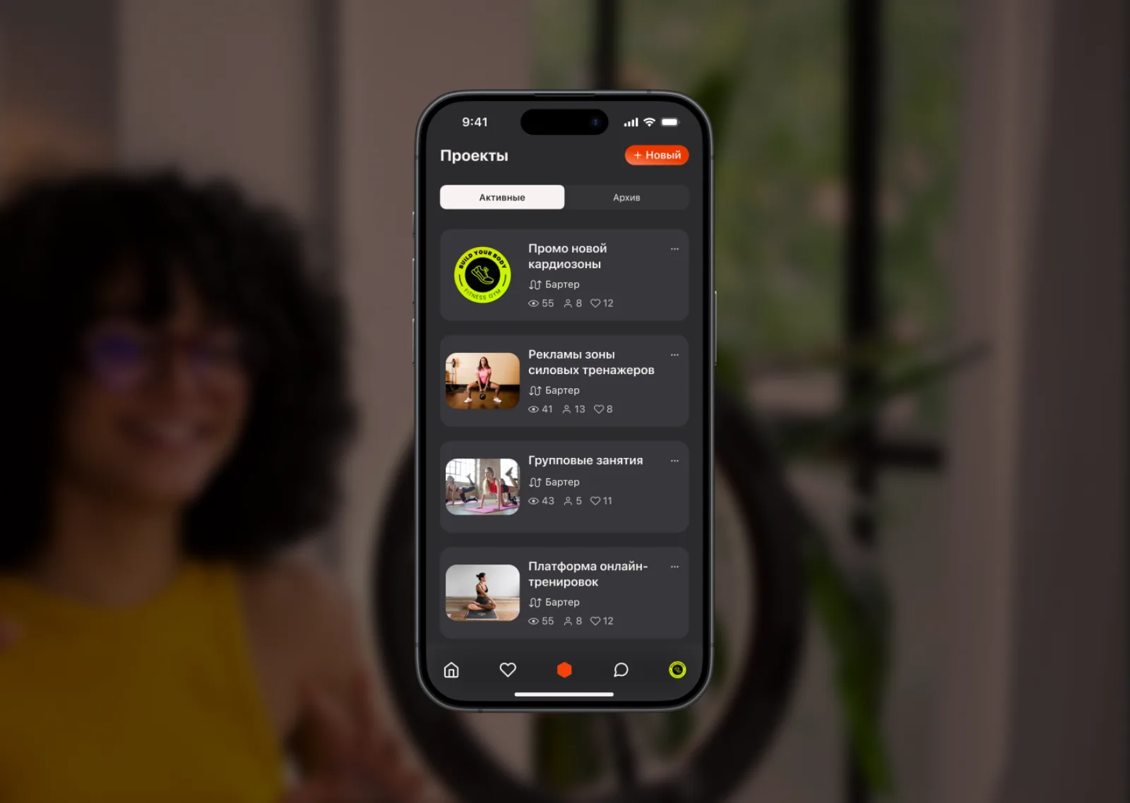
Phones first — then everything else
Every concept lived first as a phone composition. We never designed a 'desktop version' before the mobile flow felt right. This kept content density realistic and prevented the app from drifting into a website.
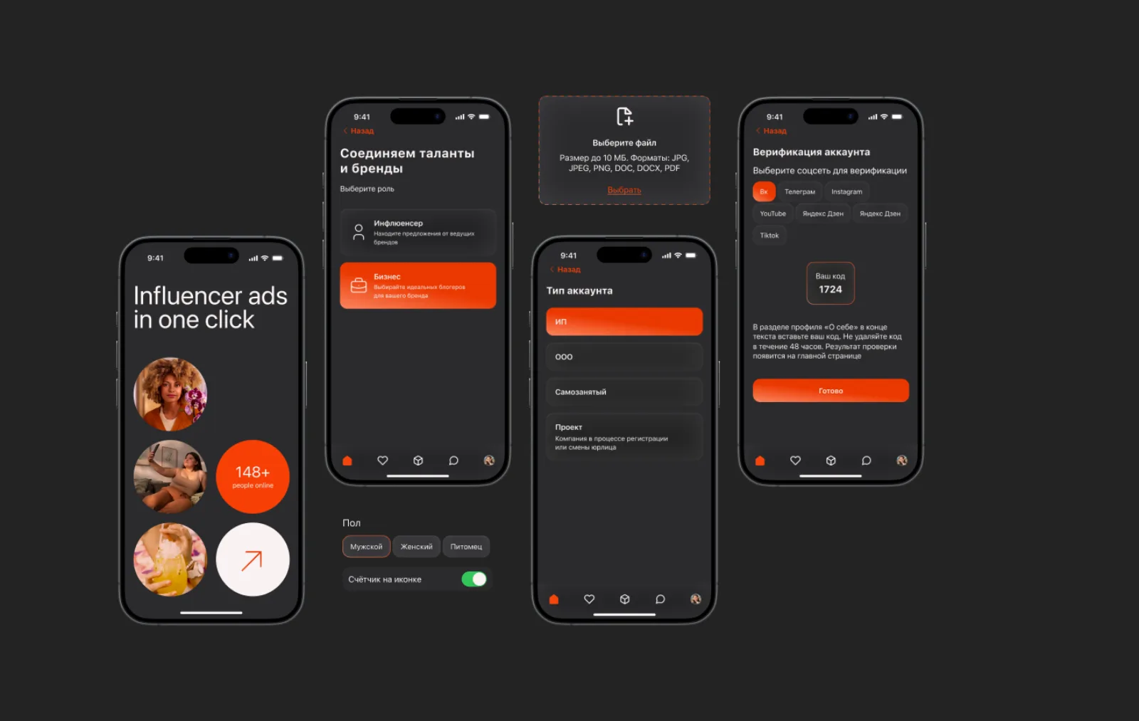
A short, opinionated flow
The whole core loop is six screens: discover, pick, request, confirm, meet, rate. Anything that wasn't required for the loop didn't ship.
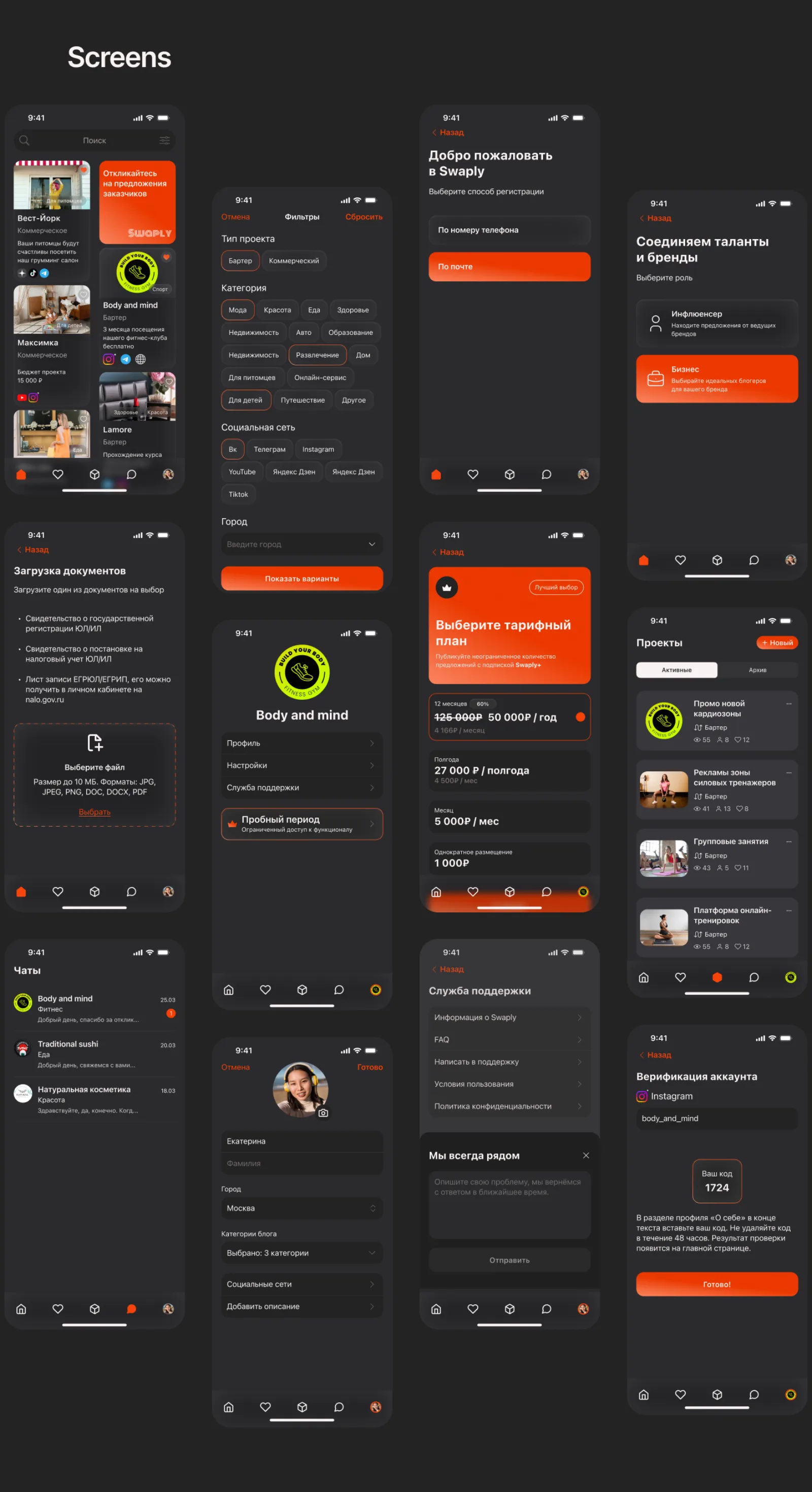
A product-shaped object, not a feature dump
By aggressively cutting scope and refusing to add a 'feed' or 'social' surface, Swaply becomes the kind of app you can describe to a friend in one sentence. That sentence is the actual product.
Have an idea worth exploring?
We help product teams turn fuzzy concepts into shippable mobile experiences — from JTBD to UI.
Discuss a Project